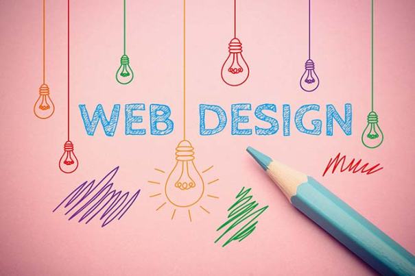
As we close out 2016, the internet is evolving again. Some of us are old enough to remember when this was the first website. That’s a lot of change in just a couple of decades. The web is changing to meet the needs of a more mobile user base, to make devices capable with doing more and producing content, apps, and websites that make the most of those abilities. We have passed the mobile tipping point where use of smartphones has surpassed the use of laptops and desktops. In fact, some of those smartphones are more powerful, with more memory and storage than the computers of 20 years ago. The internet is no longer a place we go, and the desktop is no longer how we get there – it’s in our purses, backpacks, and pockets. Here are the trends that are going to make your website work in 2017.
- Functionality over form. What good is a great looking website if there’s nothing functional to back it up? Everything on your site needs to serve a purpose from content and photos down to navigation menus and buttons. Nothing wasted or just for show.
- Numbers and facts. Vague is not cutting it. Your website is your online resume – would you put up with vague allusions to the applicant’s previous experience and education? “Graduated from a major university in the early 2000s” is not going to fly, is it?
- Google Material Design: Introduced in 2014, these design principles are still going strong with mobile app developers and web designers. It keeps sites simple, but beautiful and engaging.
- Menu control: Menus can get a bit unwieldy, especially with people on smaller screens. Trimming the menu down to the basic basics – three to four options instead of ten or twelve. Allow the user to make quick decisions and click!
- Duotones, gradients, and a rebellion against flat design. Duotones are so much more than black and white, while gradients add extra interest to a flat color palette. Flat design is making a lot of sites look alike, but web designers may be rebelling against the overly regimented web page. Functional does not need to mean boring!
If your site needs just a tune-up or an overhaul, adding these elements will bring you up to speed with the latest trends in web design. There’s nothing worse than keeping your site the same year after year as developments in technology and devices change the way we shop and get information. If you’re thinking of some updates, work with a web designer who likes to stay on the cutting edge, and can point you at developments you had no idea existed. At 4 Step Studios, we handle everything from the first lines of code to daily maintenance, digital advertising, White Hat SEO, and social media presence. Your website can get lost in the crowd, stand out in the crowd, or pull in a crowd of its own. Call us and find out how.
4 Step Studio is an online marketing agency that specializes in website design and redesign, SEO, social media and more. Our team of experts focuses on helping small business get found online, while educating them on what will make them successful in the digital world. To learn more about what we can do for you, visit our website at www.4StepStudio.com
 Get the Latest Online Marketing Trends in Web Design, Social Media, Blogging, and More.
Many thanks for the interesting post, it is very useful information for me.